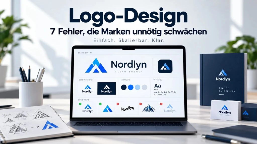
A logo is often the smallest thing on your business card – and still the first thing people see of your brand: in the browser tab, on a phone, in a proposal PDF or on a social profile. If it looks unclear, soft or generic, trust drops before anyone reads your offer. Good logo design is not just a “nice image” – it is a tool for recognition and a professional presence, closely linked to strong brand design and a website that brings enquiries.
In this article we show seven common mistakes from practice – and how to avoid them. Goal: a logo that works small and large, lasts, and fits the brand – not one that looks awkward in two years.
In short: what a strong logo must do
A strong logo is simple, easy to remember, clear at every size, right for audience and industry, usable in colour and black-and-white, and clearly distinct from competitors. If any of that fails long-term, the logo weakens the brand – often quietly, but noticeably.
Mistake 1: Too complex – too much at once
Twelve elements, three fonts, five colours and a gradient look impressive on a large screen. On a business card or tiny icon they become a blob. Too much detail costs readability and memorability – and makes printing more expensive.
Better: Less. The best-known marks can often be roughly sketched in a few seconds. A clear shape beats detail. Quick test: Can you roughly draw your logo from memory?
Mistake 2: Unreadable at small sizes
A logo must work from a tiny favicon to a large surface. Fine lines and delicate type disappear at small sizes. Without a simpler variant for social and app icons, awkward workarounds appear – and the brand feels inconsistent.
Better: A main logo plus reduced versions (symbol only, horizontal, stacked). Test tiny and huge before sign-off.
Mistake 3: Pixels only – no clean master file
Logos that only exist as JPG or PNG from a generator go soft when enlarged and block professional production. Without a vector file (e.g. SVG), you get blurry headers, expensive rework and inconsistent files in the team.
Better: A clean vector master and clear exports for web and print. That saves time and money later.
Mistake 4: Colour and contrast without a system
Too many colours feel chaotic. Weak contrast makes the logo invisible on light or dark backgrounds. Trend colours age fast. Without black-and-white and negative versions, use on photos, stickers or dark surfaces breaks.
Better: Few deliberate colours with clear codes, strong contrast and tested single-colour versions.
Mistake 5: Type that does not hold
Decorative fonts, too many typefaces or hard-to-read scripts weaken the professional impression. Type is brand language: if it feels wrong, the brand feels wrong – especially small and on the web.
Better: A clear wordmark or a matched pair of symbol and readable type. Clarify licence rights. Readability before effect.
Mistake 6: Trend only – or a logo that does not fit
What looks “modern” today can look dated tomorrow: heavy gradients, short-lived style fads, generic AI patterns. Equally problematic: designs that please founders but miss the audience or industry – craft looking like a tech startup, a traditional firm looking like an influencer brand.
Better: First clarify what the brand stands for – then the form. Use trends sparingly as an accent, not as the foundation. Check competitors – and avoid clichés without becoming invisible.
Mistake 7: No rules – the brand falls apart day to day
Without clear guidelines, dozens of variants appear within months: stretched, with shadows, wrong colours, too close to the edge. Print, web and social then decide on their own. Recognition and trust suffer – even if the original was good.
Better: A short style guide: clear space, minimum size, allowed variants, colour codes, do’s and don’ts. That belongs with the logo – not as optional luxury.
Checklist: is your logo brand-ready?
- Simple and memorable?
- Clear at very small and very large sizes?
- Available as a vector file?
- Colour and black-and-white / negative tested?
- Type readable and licensed?
- Fits audience and positioning?
- Distinct from competitors?
- Are there usage rules?
Several “no” answers? Then the logo is already weakening the brand – often unnoticed in daily work.
Logo, brand design and website belong together
A logo alone is not a brand. It needs context: colour, type, imagery – and a website that carries the brand and generates enquiries. If you are resetting anyway, also read: when rebranding is really worth it and why good web design measurably drives more enquiries.
How we work at Fisher Design
We start from brand and use cases (web, print, icon), design clear scalable systems and deliver files plus understandable usage rules. That keeps your presence strong across channels – and the website feels like one piece. More under brand design.
Request a quote for logo and brand design
Takeaway
These seven logo design mistakes weaken brands unnecessarily: too much complexity, poor readability at small sizes, pixels instead of clean files, weak colours, unclear type, trend without strategy and missing rules. Avoid them and you invest in recognition and trust – the base for website, sales and growth.
Ready for a logo that holds? Talk to Fisher Design – we design marks that work digitally and in print.