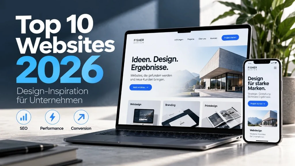
Which websites are actually worth copying in 2026 if you run a business? Not the loudest award shows – but sites you can learn from for clarity, trust and enquiries. We looked at strong brand and campaign sites and turned them into simple takeaways for mid-market and B2B companies.
This overview is design inspiration for businesses: what makes good web design, what visitors care about – and how your site becomes a source of new enquiries. At the end we show how Fisher Design turns these ideas into real website projects.
What strong company websites share in 2026
Whether well-known product brands or award-winning campaign sites – the best ones follow patterns you can apply without a huge budget:
- Instantly clear: benefit, audience and next step are obvious at the top.
- Fast: people who wait click away – speed is part of design.
- Phone-friendly: text and buttons work as well on a smartphone as on a desktop.
- Calm typography: readable type, clear headlines, enough space instead of chaos.
- A clear path to enquire: contact visible, references easy to find, no dead ends.
- Trustworthy: usable, legally sound, credible.
Spectacular 3D effects dominate many award lists. For most companies they are spice, not the main course. What matters: does a visit become a conversation?
The Top 10: inspiration and takeaways for your web design
1. Stripe – clarity that builds trust
stripe.com shows how complex products feel reliable with calm type and clear language. For companies that means: fewer feature lists, more benefit – and a button you find immediately.
Takeaway: Less is often more. A company website needs focus, not effects.
2. Linear – speed and calm
linear.app proves that modern product pages win with speed and a tight interface. Every interaction feels light – without distraction.
Takeaway: Slow pages lose trust before the content can work.
3. Apple – brand leads, menu follows
apple.com remains a model for clear sections: large images, short copy, strong hierarchy. The brand leads – not the menu.
Takeaway: A strong visual line makes offers tangible. Brand design and web design belong together.
4. Notion – making the complex simple
notion.com explains a versatile product through clear use cases. Users find their way quickly.
Takeaway: Structure services around your customers’ problems – not your internal org chart.
5. Personio – B2B trust in German
personio.de is a strong example of German-language B2B communication: clear benefit, industry relevance, visible proof.
Takeaway: Concrete advantages and customer voices belong on the homepage – not only at the bottom.
6. Decathlon Yestalgia – story with stance
The campaign site Decathlon Yestalgia (incl. Awwwards Site of the Day, August 2026) shows how brands can combine emotion and craft without losing the product core.
Takeaway: Storytelling works when it leads to an offer. Emotion without a next step stays a show.
7. MIU MIU – premium without overload
The award-winning presentation MIU MIU – A House that we shaped (Awwwards Site of the Day 2026) shows how fashion and lifestyle brands stage digital spaces as experiences.
Takeaway: Premium works through discipline: good images, clear type and rhythm – not through chaos.
8. Squarespace Foundations – system over one-offs
The site Squarespace Foundations (Awwwards Site of the Day, September 2026) stands for design systems and recurring building blocks.
Takeaway: Modules for services, FAQ, cases and CTA make websites easy to maintain – ideal for growing companies.
9. Porsche – beautiful and still orienting
porsche.com connects emotional imagery with clear guidance to models and dealers. The brand stays strong – and you still find what you need.
Takeaway: Even strong brands need orientation. Beauty without findability costs enquiries.
10. Webflow – explain clearly, then prove it
webflow.com communicates offer and community in a calm flow: intro, benefit, proof, next step.
Takeaway: Explain your offer in your customers’ language – and show proof before listing features.
What companies should really take from 2026
Not every award website is a blueprint for the mid-market. Take the principles – not the spectacle:
- One clear main message per page
- One clear button (e.g. request a quote)
- Fast load times and clean engineering
- Real references and projects
- Findable structure: sensible headings, internal links, understandable copy
- Good usability on phone and desktop
That is how design inspiration becomes measurable impact: more visibility, more trust, more enquiries.
From inspiration to your own website
At Fisher Design we build websites that think brand, user guidance and findability together – from strategy to launch. Whether redesign or new build: the goal is a site that gets found and generates enquiries.
More about our approach under Web design. See practice, for example Art Decor AI.
Request a quote for your website
Short takeaway
The Top 10 Websites 2026 inspire visually – and show what modern company websites prioritise: clarity, speed, brand and the path to an enquiry. Apply these patterns consistently and you improve your chance of being found in Google and turning visitors into customers.
Ready for the next step? Talk to Fisher Design about your web design project – we translate inspiration into a website that works for your business.